Monday, 13 May 2013

James Turrell

Much of Turrell's work appears so simple but similarly to Eliasson he uses colour's emmersive qualities to create  surreal spaces which play with depth/ flatness and three dimensionality of light. These images can only convey a mere sense of what it is like to experience his work 1:1 in the flesh.


Olafur Eliasson

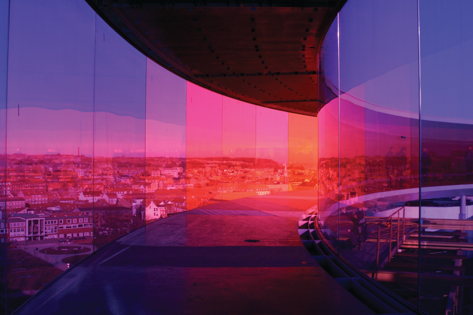
Naomi has already posted an example of Eliasson's work but I thought I would add a few more to get the inspiration flowing. Eliasson's work bridges art installation and architecture to create immersive atmospheres, often utilising colour to aide this.


The Weather Project in the Tate Modern Turbine Hall

'Your Atmospheric Atlas'


'Your Rainbow Panorama'


Bridget Riley - Op Art

Karn and I were talking to Oscar today about the work of British Op Artist Bridget Riley. Below are some examples of her work. The organisation of colours appears to play tricks on the eye - with lines shifting around and parts appear darker or lighter due to the colour contrast and proximity.


Colour in Architecture

Below are but a few examples of architectural practices who boldly use colour as a distinctive part of their work. If people think of others I encourage you to post some of their work.


Luis Barrigan - Mexico's most famous architect (received the Pritzker Prize in 1980). Know for his use of colour, both exteriorally and interiorally


French-Kiwi Parisian firm Jakob and MacFarlane have a penchant for lime green and orange.


Sauerbruch Hutton are a large german firm who are know for their use of banded colour on buildings


The Brandhorst Gallery in Munich - wonderful use of colours that wouldn't immediately seem to work well together.

Thursday, 9 May 2013

Emotive with colour

This painting is by K.Madison Moore.
I found a lot of her paintings were quite emotive in terms saturating monochromatic colours. This particular painting appeals to me because of the variety of saturation of blue. I find this gives the painting depth and the way the lady and positioned, represents exhaustion. I have been considering bringing in emotion into my installation so that 'sight' isn't the only sense you would be getting.


Wednesday, 8 May 2013

'Reimagine'

No Colour, but this is still pretty cool. By a guy called Olafur Eliasson

Sunday, 7 April 2013

Installation experimentation


These photos were taken during the tutorial group exercise to create a prototype installation. Tim, Helen, Lachie and myself constructed essentially a layered frame which was offset by a black negative background. The group investigated how various lit textures and shapes interacted in an enclosed space.